
01 / 14 — Brand Identity
Bomber Brand Identity
An expanded brand system that gives Bomber a sharper, more distinct voice in performance activewear.
Ahead of launch, Bomber needed a bold brand system that could match its ambition and grow with the brand. I expanded the existing identity into a more complete and distinct visual language, introducing a new typography system, broader digital color palette, and tone of voice rooted in the confidence and energy of Bomber.
I brought the system to life across email, social and a redesigned website, creating a cohesive brand experience that feels unmistakably Bomber at every touchpoint.
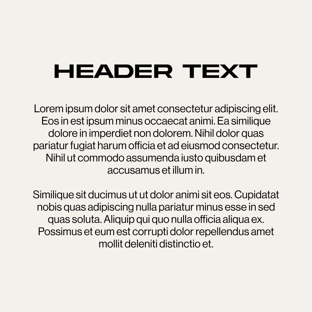
Typography & color
The wordmark now stands alone, supported by a new primary typeface, an expanded secondary typeface and a hand-drawn accent, with a palette widened for digital depth and flexibility across channels.

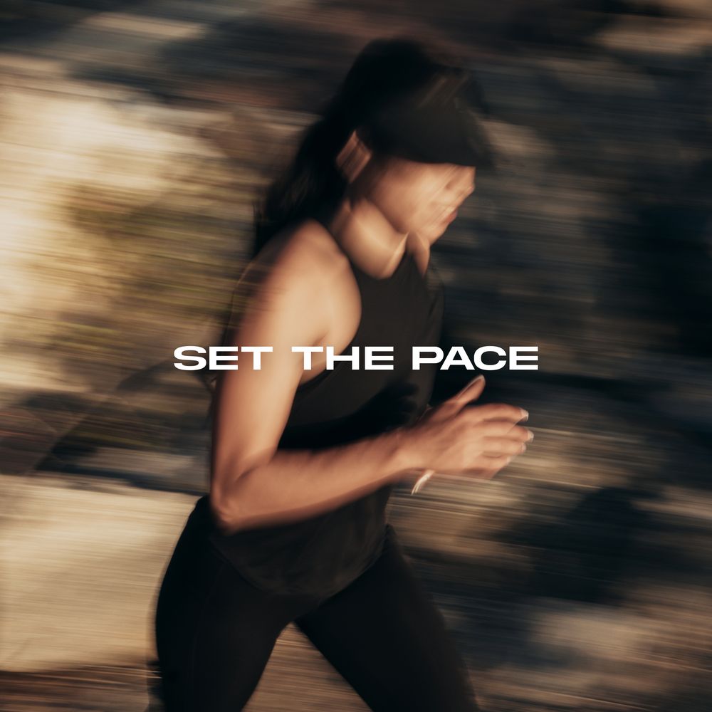


Visual direction
Imagery rooted in real effort, movement and the culture of sport.

Website
A redesigned site built on the new system, from campaign-led landing pages to product storytelling.
Social
Campaign and product content for social, built on the visual direction.

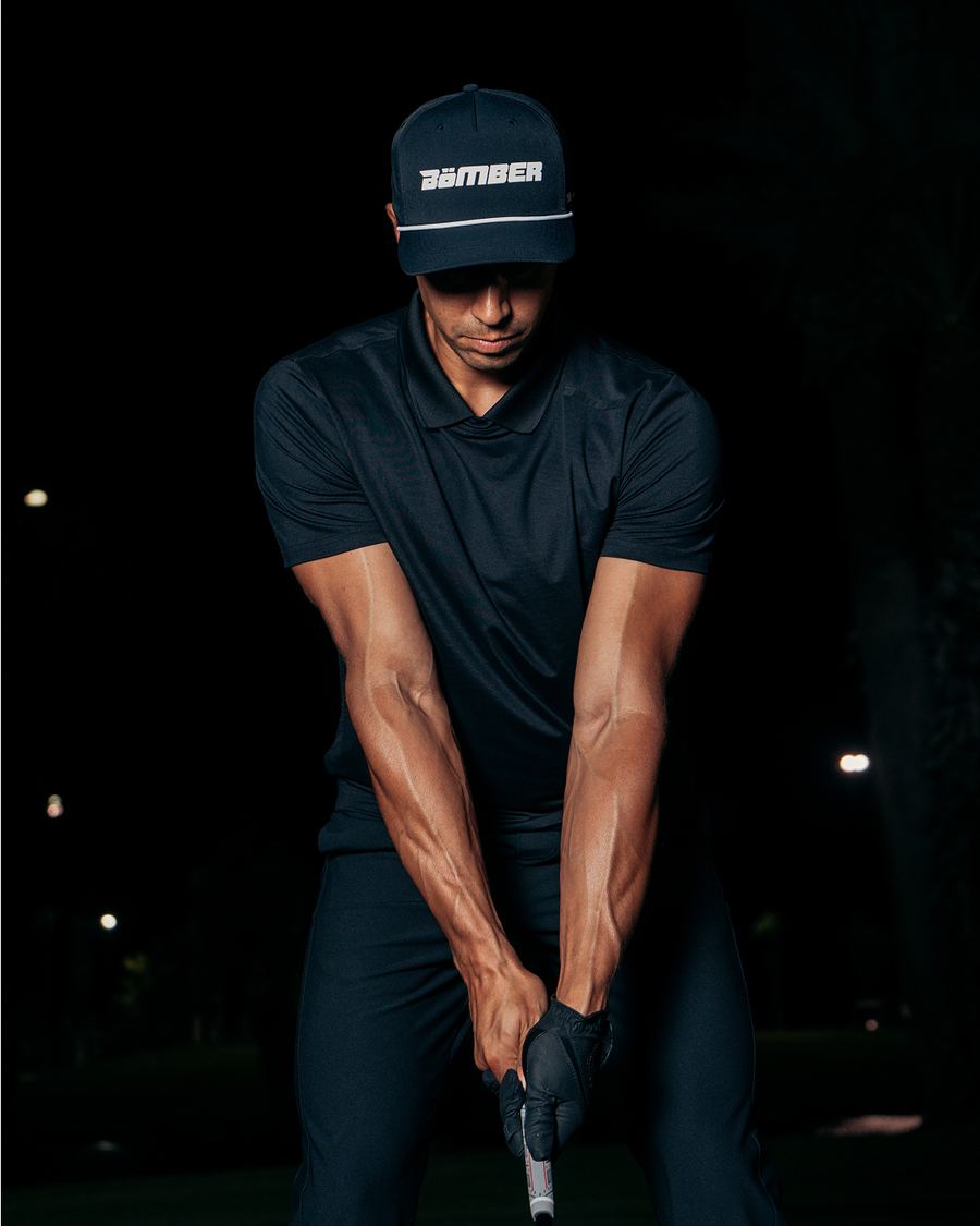
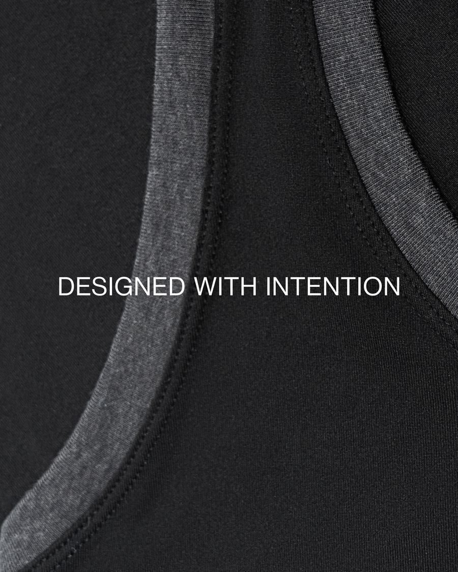



Welcome, product and review emails that bring the voice, type and color to the inbox.
Credits
- Creative Direction & Brand Identity
- Ryan O'Connor